Concepts:
- Interpretation after log transforms
- Plotting and predicting with transformations
- Lack of fit tests
Interpretation after log transforms
library(tidyverse)
library(broom)
library(Sleuth3)?ex0921“The goal is to see whether the distribution of species’ ingestion rates depends on the percentage of organic matter in the food, after accounting for the effect of species weight and to describe the association.”
Exploratory analysis
library(GGally)
ex0921 %>%
  select(-Species) %>%
  ggpairs(
    upper = "blank",
    lower = list(continuous = "points", combo = "box"),
    diag = list(continuous = "densityDiag", discrete = "barDiag"),
    axisLabels='show'
  )
Order of magnitude differences + clumping in low end suggests log transform. Easiest way for this library (GGally) is to produce logged versions of the vars:
ex0921_log <- ex0921 %>%
  mutate_if(is.numeric, log)

ex0921_log %>%
  select(-Species) %>%
  ggpairs(
    upper = "blank",
    lower = list(continuous = "points", combo = "box"),
    diag = list(continuous = "densityDiag", discrete = "barDiag"),
    axisLabels='show'
  )
A tentative model:
fit_ingest <- lm(log(Ingestion) ~ log(Organic) + log(Weight), data = ex0921)
summary(fit_ingest)
##
## Call:
## lm(formula = log(Ingestion) ~ log(Organic) + log(Weight), data = ex0921)
##
## Residuals:
## Min 1Q Median 3Q Max
## -1.3627 -0.1313 0.1975 0.3218 0.6421
##
## Coefficients:
## Estimate Std. Error t value Pr(>|t|)
## (Intercept) 3.39507 0.32447 10.463 1.46e-08 ***
## log(Organic) -0.91681 0.09377 -9.777 3.75e-08 ***
## log(Weight) 0.77083 0.05553 13.882 2.43e-10 ***
## ---
## Signif. codes: 0 '***' 0.001 '**' 0.01 '*' 0.05 '.' 0.1 ' ' 1
##
## Residual standard error: 0.5448 on 16 degrees of freedom
## Multiple R-squared: 0.9797, Adjusted R-squared: 0.9771
## F-statistic: 385.5 on 2 and 16 DF, p-value: 2.917e-14fit_ingest_diag <- augment(fit_ingest, data = ex0921)
ggplot(fit_ingest_diag, aes(.fitted, .resid)) +
geom_hline(yintercept = 0, color = "white", size = 2) +
geom_point()
Looks ok.
Your turn Check other diagnostics.
summary(fit_ingest)##
## Call:
## lm(formula = log(Ingestion) ~ log(Organic) + log(Weight), data = ex0921)
##
## Residuals:
## Min 1Q Median 3Q Max
## -1.3627 -0.1313 0.1975 0.3218 0.6421
##
## Coefficients:
## Estimate Std. Error t value Pr(>|t|)
## (Intercept) 3.39507 0.32447 10.463 1.46e-08 ***
## log(Organic) -0.91681 0.09377 -9.777 3.75e-08 ***
## log(Weight) 0.77083 0.05553 13.882 2.43e-10 ***
## ---
## Signif. codes: 0 '***' 0.001 '**' 0.01 '*' 0.05 '.' 0.1 ' ' 1
##
## Residual standard error: 0.5448 on 16 degrees of freedom
## Multiple R-squared: 0.9797, Adjusted R-squared: 0.9771
## F-statistic: 385.5 on 2 and 16 DF, p-value: 2.917e-14Your Turn:
- Interpret the coefficient on log(Weight) on the log scale
- Interpret the coefficient on log(Weight) on the original scale
- Interpret the effect of Weight on the original scale
# ... assuming response is symmetric on log scale
ggplot(fit_ingest_diag, aes(sample = .resid)) +
  geom_qq() +
  geom_qq_line()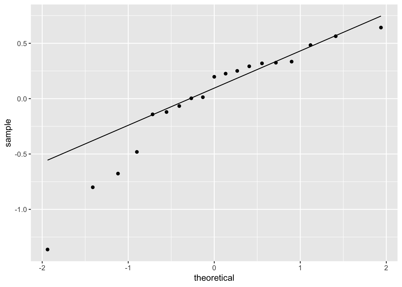
# hard to tell, maybe suspicious here...
# (check later: box-cox transform)
Plotting predictions with transforms
Let’s say we want a plot of Ingestion rates as a function of Organic material for an average weight species
Our previous approach works just as well here:
library(modelr)
pred_df <- data_grid(data = ex0921,
  Weight = mean(Weight),
  Organic = seq(1, 100, 1)
)

add_predictions(model = fit_ingest, data = pred_df)
## # A tibble: 100 x 3
## Weight Organic pred
## <dbl> <dbl> <dbl>
## 1 215. 1 7.54
## 2 215. 2 6.90
## 3 215. 3 6.53
## 4 215. 4 6.27
## 5 215. 5 6.06
## 6 215. 6 5.89
## 7 215. 7 5.75
## 8 215. 8 5.63
## 9 215. 9 5.52
## 10 215. 10 5.42
## # … with 90 more rowsBut these are predictions of log(Ingestion).
To plot the predictions are confidence intervals for them it’s actaully a little easier to use augment() from broom, rather than add_predictions() from modelr, because you can get the standard errors. Let’s do that and add 95% confidence limits on these predicted means:
fit_df <- df.residual(fit_ingest)
pred_df_se <- augment(fit_ingest, newdata = pred_df) %>%
  mutate(
    lower = .fitted - qt(0.975, df = fit_df) * .se.fit,
    upper = .fitted + qt(0.975, df = fit_df) * .se.fit,
    )
Let’s look at these predictions on the modelled scale:
ggplot(pred_df_se, aes(log(Organic), .fitted)) +
  geom_line() +
  ylab("Estimated mean log(Ingestion)")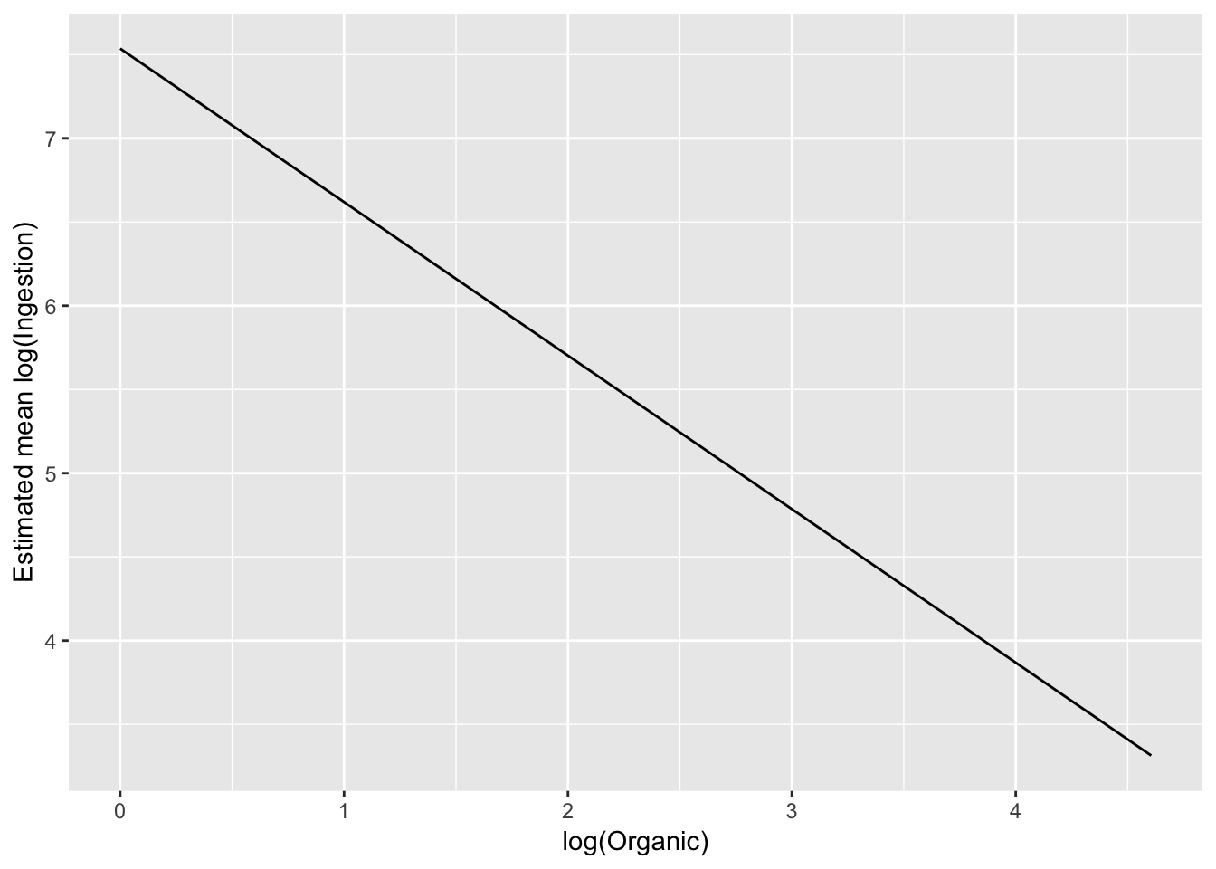
# linear on the log-log scaleTo exmaine on the original scale, back transform the estimate:
# just put it on the orignal scale
ggplot(pred_df_se, aes(log(Organic), exp(.fitted))) +
  geom_line() +
  ylab("Estimated mean Ingestion")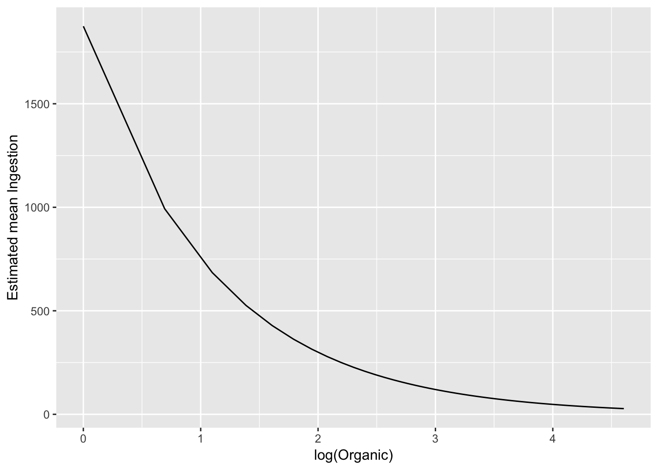
Confidence band on modelled scale:
ggplot(pred_df_se, aes(log(Organic), .fitted)) +
  geom_line() +
  geom_ribbon(aes(ymax = upper, ymin = lower), alpha = 0.2) +
  ylab("Estimated mean Ingestion")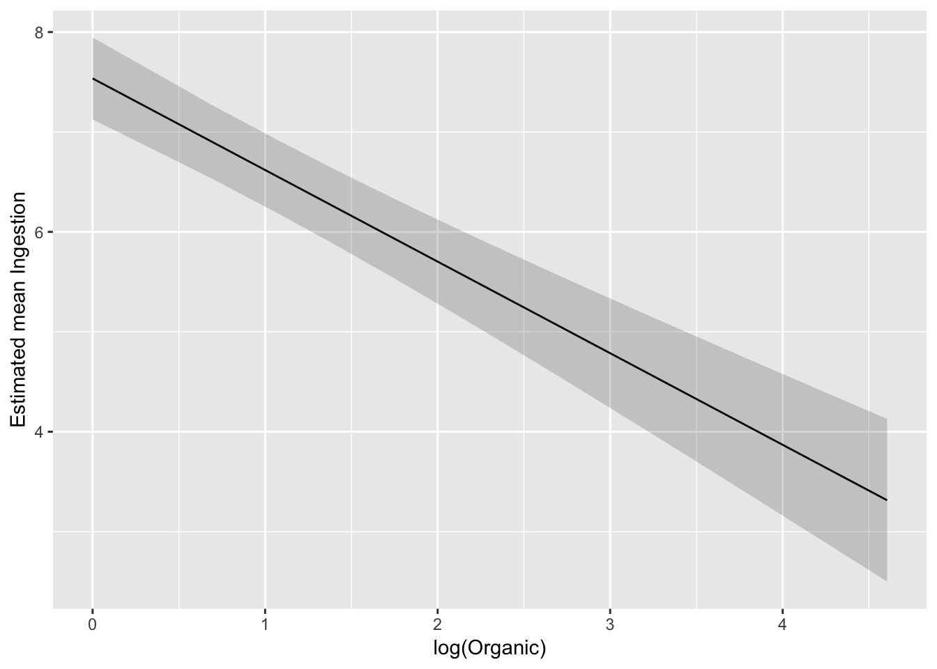
We can also backtransform confidence limits:
ggplot(pred_df_se, aes(log(Organic), exp(.fitted))) +
  geom_line() +
  geom_ribbon(aes(ymax = exp(upper), ymin = exp(lower)), alpha = 0.2) +
  ylab("Estimated mean Ingestion")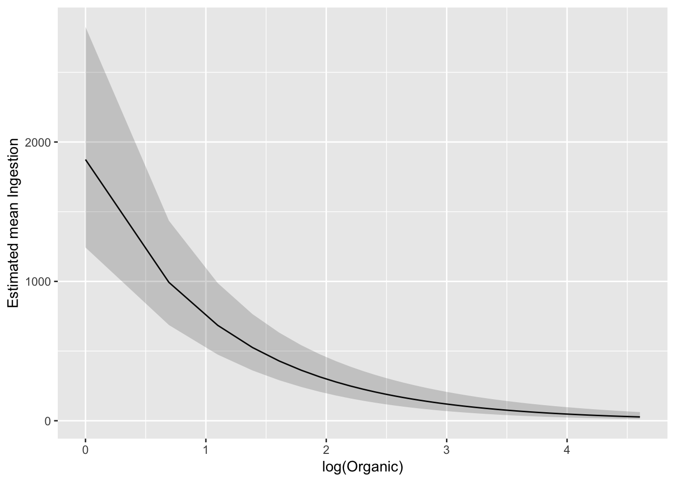
And plot against untransformed Organic
ggplot(pred_df_se, aes(Organic, exp(.fitted))) +
  geom_line() +
  geom_ribbon(aes(ymax = exp(upper), ymin = exp(lower)), alpha = 0.2) +
  ylab("Estimated mean Ingestion")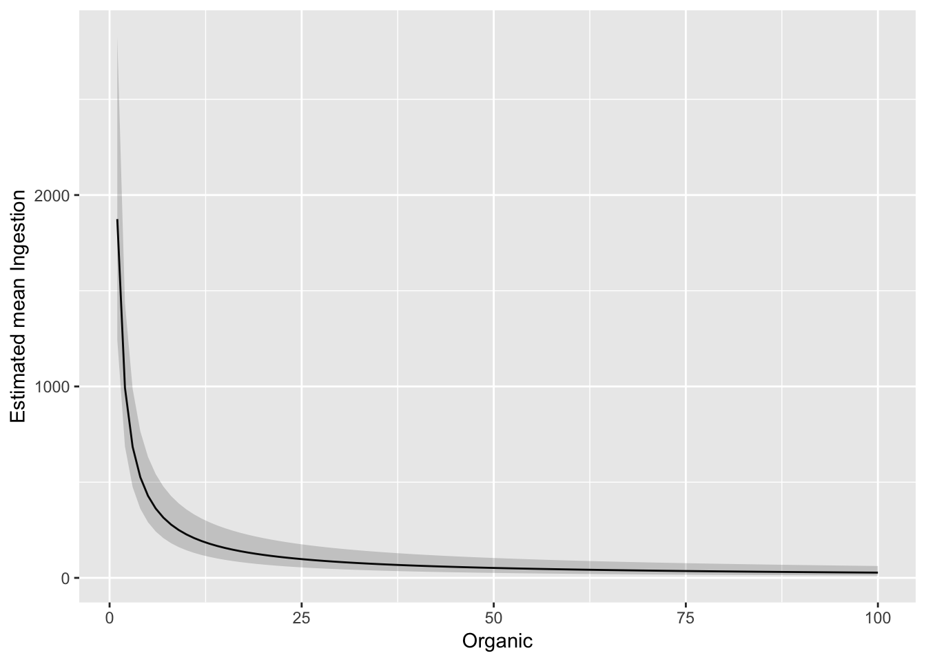
Lack of fit F-test example
?ex1030Some exploration:
ex1030 %>%
  ggplot(aes(Age, WeeklyEarnings)) +
    geom_point(alpha = I(0.2))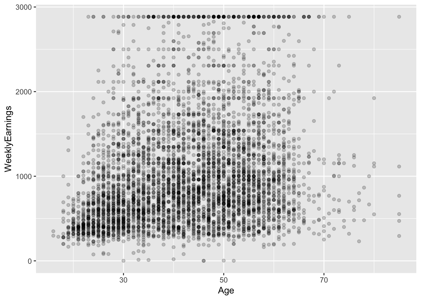
ex1030 %>%
  ggplot(aes(factor(EducationCode), WeeklyEarnings)) +
    geom_boxplot()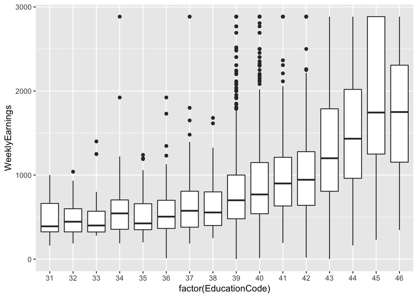
ex1030 %>%
  ggplot(aes(Race, WeeklyEarnings)) +
    geom_boxplot() +
    facet_wrap(~ Region)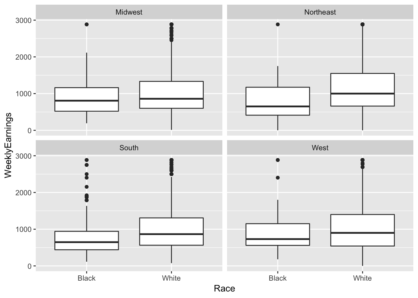
# What else?Fit a tenative model:
fit_earn <- lm(log(WeeklyEarnings) ~ Race*Region + Age +
    EducationCategory + MetropolitanStatus, data = ex1030)

fit_earn_diag <- augment(fit_earn, data = ex1030)

ggplot(fit_earn_diag, aes(.fitted, .resid)) +
  geom_point(alpha = 0.2)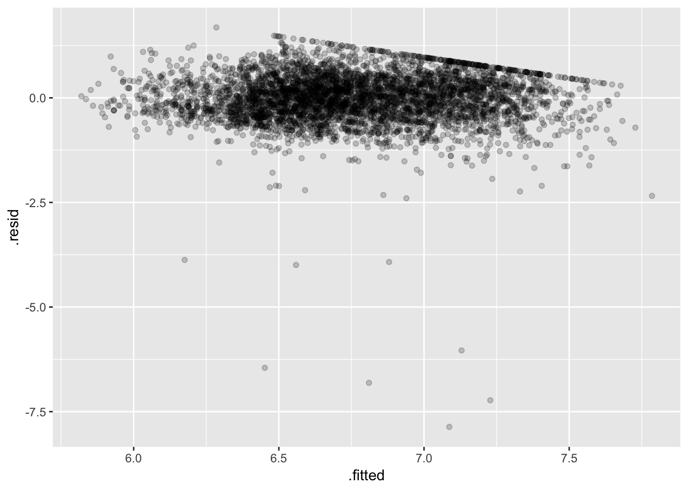
Some bad low outliers (consequence of the log transfom) hopefully not too influential (should check…).
Setting up a satuarated model:
# like one mean per group, where group is every combination of vars
ex1030 <- ex1030 %>%
  mutate(
    groups = interaction(Race, Region, Age, EducationCategory, MetropolitanStatus)
  )
length(unique(ex1030$groups)) # 2224 combinations
## [1] 2224ex1030 %>%
group_by(groups) %>%
count() %>%
filter(n == 1)## # A tibble: 1,241 x 2
## groups n
## <fct> <int>
## 1 White.Northeast.18.AssocDegAcadem.Metropolitan 1
## 2 White.South.20.AssocDegAcadem.Metropolitan 1
## 3 White.Midwest.22.AssocDegAcadem.Metropolitan 1
## 4 White.Northeast.23.AssocDegAcadem.Metropolitan 1
## 5 White.South.24.AssocDegAcadem.Metropolitan 1
## 6 White.Midwest.25.AssocDegAcadem.Metropolitan 1
## 7 Black.South.25.AssocDegAcadem.Metropolitan 1
## 8 White.Midwest.26.AssocDegAcadem.Metropolitan 1
## 9 Black.South.26.AssocDegAcadem.Metropolitan 1
## 10 White.Northeast.27.AssocDegAcadem.Metropolitan 1
## # … with 1,231 more rows# 1241 groups with only one observation in themThis is how we would fit a saturated model, but don’t do it, it takes forever:
fit_earn <- lm(log(WeeklyEarnings) ~
    Race*Region*factor(Age)*EducationCategory*MetropolitanStatus, data = ex1030)
# Takes too long!!!
Rather than fitting with lm (it takes awhile), I’m going to find the SS manually:
RSS_sat <- ex1030 %>%
  group_by(groups) %>%
  mutate(
    grp_avg = mean(log(WeeklyEarnings))
  ) %>%
  with(sum((log(WeeklyEarnings) - grp_avg)^2))
RSS_earn <- sum(residuals(fit_earn)^2)
n <- sum(!is.na(ex1030$WeeklyEarnings))
# any(is.na(ex1030))
p_sat <- length(unique(ex1030$groups))
p_earn <- length(coef(fit_earn))
# lack of fit F-test, check my work!
df_top <- (p_sat - p_earn)
df_bottom <- (n - p_sat)
F <- ((RSS_earn - RSS_sat)/df_top) / (RSS_sat / df_bottom)
1 - pf(F, df_top, df_bottom)## [1] 0.4684688I’m surprised by this a little, I suspect becasue df_bottom is small (relative to \(n\)) we have very little power to detect problems (but also check my work).
It’s probably more common to use the lack-of-fit to examine more directed questions like: is it OK to treat Age as linear?
fit_earnAge <- lm(log(WeeklyEarnings) ~ Race*Region + factor(Age) +
    EducationCategory + MetropolitanStatus, data = ex1030)
anova(fit_earn, fit_earnAge)
## # A tibble: 2 x 6
## Res.Df RSS Df `Sum of Sq` F `Pr(>F)`
## <dbl> <dbl> <dbl> <dbl> <dbl> <dbl>
## 1 4926 1586. NA NA NA NA
## 2 4862 1521. 64 64.2 3.21 2.89e-16# nopeBut quadratic might be enough:
fit_earnAge2 <- lm(log(WeeklyEarnings) ~ Race*Region + Age + I(Age^2) +
    EducationCategory + MetropolitanStatus, data = ex1030)
anova(fit_earnAge2, fit_earnAge)
## # A tibble: 2 x 6
## Res.Df RSS Df `Sum of Sq` F `Pr(>F)`
## <dbl> <dbl> <dbl> <dbl> <dbl> <dbl>
## 1 4925 1538. NA NA NA NA
## 2 4862 1521. 63 17.0 0.864 0.769pred_df_age <- data_grid(ex1030, .model = fit_earnAge2,
Age = seq(16, 85, 1)
)
# Check the values used for the other vars in the modelTake a look at this fitted form:
augment(fit_earnAge2, newdata = pred_df_age) %>%
  mutate(
    lower = .fitted - 1.96 * .se.fit,
    upper = .fitted + 1.96 * .se.fit,
    ) %>%
ggplot(aes(Age, exp(.fitted))) +
  geom_line() +
  geom_ribbon(aes(ymax = exp(upper), ymin = exp(lower)), alpha = 0.2) +
  ylab("Estimated mean weekly earnings")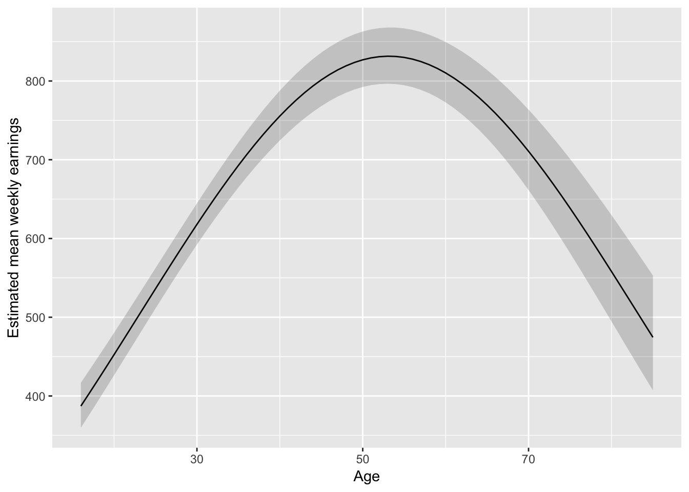
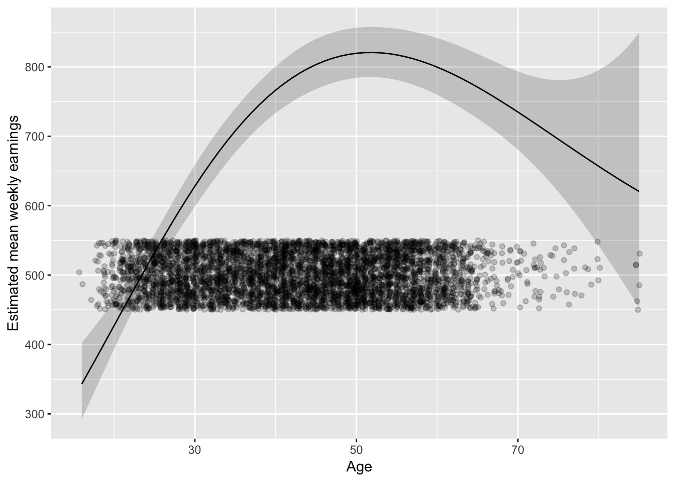
I might lean towards something slightly less parametric:
library(splines)
fit_earnAge3 <- lm(log(WeeklyEarnings) ~ Race*Region + bs(Age, 4) +
    EducationCategory + MetropolitanStatus, data = ex1030)

augment(fit_earnAge3, newdata = pred_df_age) %>%
  mutate(
    lower = .fitted - 1.96 * .se.fit,
    upper = .fitted + 1.96 * .se.fit,
    ) %>%
ggplot(aes(Age, exp(.fitted))) +
  geom_line() +
  geom_ribbon(aes(ymax = exp(upper), ymin = exp(lower)), alpha = 0.2) +
  ylab("Estimated mean weekly earnings")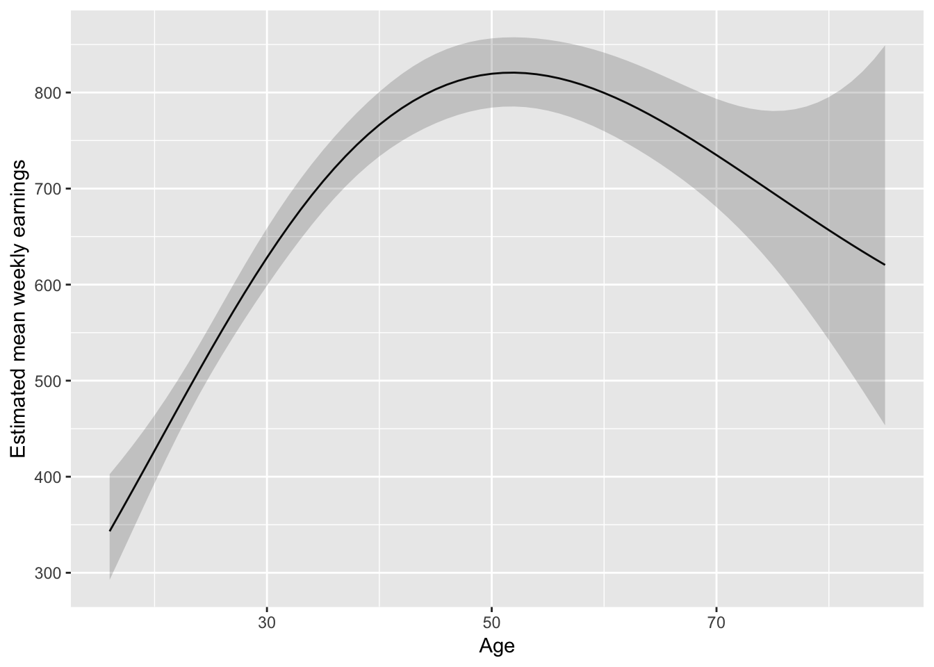
But don’t forget about where the data is:
last_plot() + geom_jitter(aes(Age, 500), data = ex1030,
  position = position_jitter(height = 50), alpha = 0.2)