library(tidyverse)
library(broom)
data(gala, package = "faraway")
fit_gala <- lm(Species ~ Area + Elevation + Nearest + Scruz + Adjacent,
data = gala)Residual plots
We could pull out things from the model “by hand”:
residuals(fit_gala)
fitted(fit_gala)
But I prefer to keep the residuals and fitted values lined up together with the data. One way to do this is with the augment() function in the broom package. The first argument is a model, the data argument is optional but I’d usually supply it to ensure you get column that were in the data, but not necessarily in the model:
augment(fit_gala, data = gala)## # A tibble: 30 x 15
## .rownames Species Endemics Area Elevation Nearest Scruz Adjacent
## <chr> <dbl> <dbl> <dbl> <dbl> <dbl> <dbl> <dbl>
## 1 Baltra 58 23 25.1 346 0.6 0.6 1.84
## 2 Bartolome 31 21 1.24 109 0.6 26.3 572.
## 3 Caldwell 3 3 0.21 114 2.8 58.7 0.78
## 4 Champion 25 9 0.1 46 1.9 47.4 0.18
## 5 Coamano 2 1 0.05 77 1.9 1.9 904.
## 6 Daphne.M… 18 11 0.34 119 8 8 1.84
## 7 Daphne.M… 24 0 0.08 93 6 12 0.34
## 8 Darwin 10 7 2.33 168 34.1 290. 2.85
## 9 Eden 8 4 0.03 71 0.4 0.4 18.0
## 10 Enderby 2 2 0.18 112 2.6 50.2 0.1
## # … with 20 more rows, and 7 more variables: .fitted <dbl>, .se.fit <dbl>,
## # .resid <dbl>, .hat <dbl>, .sigma <dbl>, .cooksd <dbl>,
## # .std.resid <dbl>Check out all the new columns: .fitted, .se.fit, .resid, .sigma, .cooksd, .std.resid. Take a look at the “Value” section in ?augment.lm to find out what they are.
We’ll save the result so we can use it to produce plots:
gala_diags <- augment(fit_gala, data = gala)Then we can use our usual plotting techniques to take a look.
Residuals plotted against the fitted values:
ggplot(gala_diags, aes(.fitted, .resid)) +
  geom_hline(yintercept = 0, size = 2, color = "white") +
  geom_point()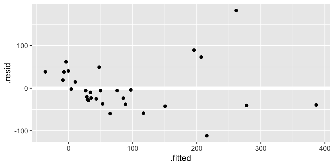
The
geom_hline()call is adding a horizontal reference line at zero to help your eye look for patterns. You don’t want this reference line to overpower the data, so here I made it white.Residuals against the various explanatory variables:
ggplot(gala_diags, aes(Area, .resid)) +
  geom_hline(yintercept = 0, size = 2, color = "white") +
  geom_point()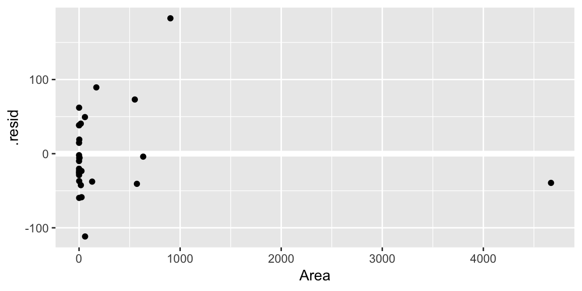
ggplot(gala_diags, aes(Elevation, .resid)) +
  geom_hline(yintercept = 0, size = 2, color = "white") +
  geom_point()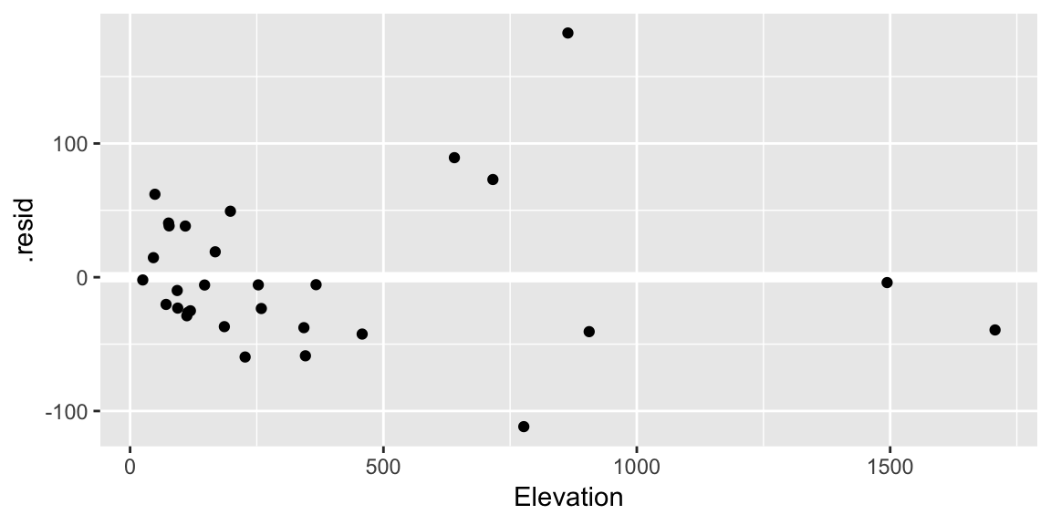
ggplot(gala_diags, aes(Nearest, .resid)) +
  geom_hline(yintercept = 0, size = 2, color = "white") +
  geom_point()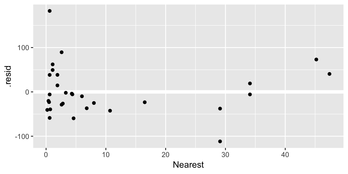
ggplot(gala_diags, aes(Scruz, .resid)) +
  geom_hline(yintercept = 0, size = 2, color = "white") +
  geom_point()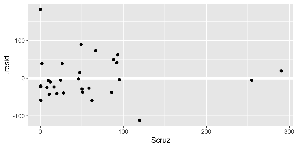
A Q-Q plot of the residuals:
ggplot(gala_diags, aes(sample = .resid)) +
  geom_qq_line() +
  geom_qq()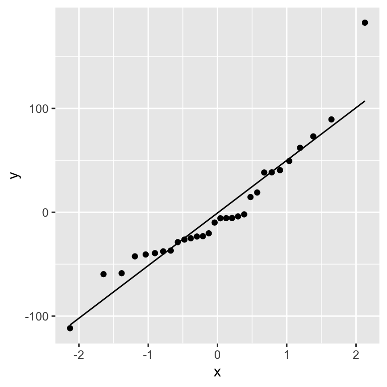
Your turn What problems do you see? Which is the biggest problem? (Remember the rough hierarchy from class)
Have you got any ideas about how to fix the problem? Try your ideas and reexamine the plots.
Calibrating your eyes
It’s useful to look at plots where the assumptions are satisfied to help learn what patterns can be attributed to sampling variability. We’ll make use of the nullabor package that helps streamline the process:
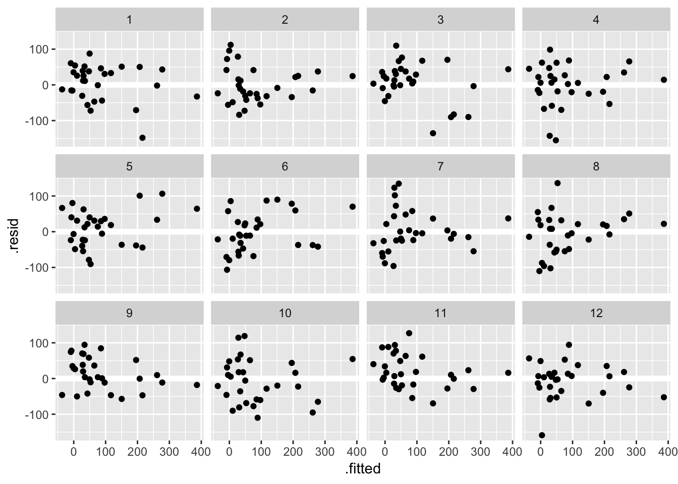
library(nullabor)As we saw in class one way to train your eye is to look at plots where assumptions are satisfied. Here are 12 residual versus fitted value plots where the residuals were simulated to be i.i.d Normal:
Another approach, known as a lineup, is to embed the true data among the simulated ones. Take a look at these 12 residual versus fitted value plots. In eleven panels, the residuals have been simulated i.i.d from a Normal distribution, and in the remaining panel the residuals are those from the fit_gala:
## decrypt("ESh1 N8L8 JR t7pJLJ7R eT")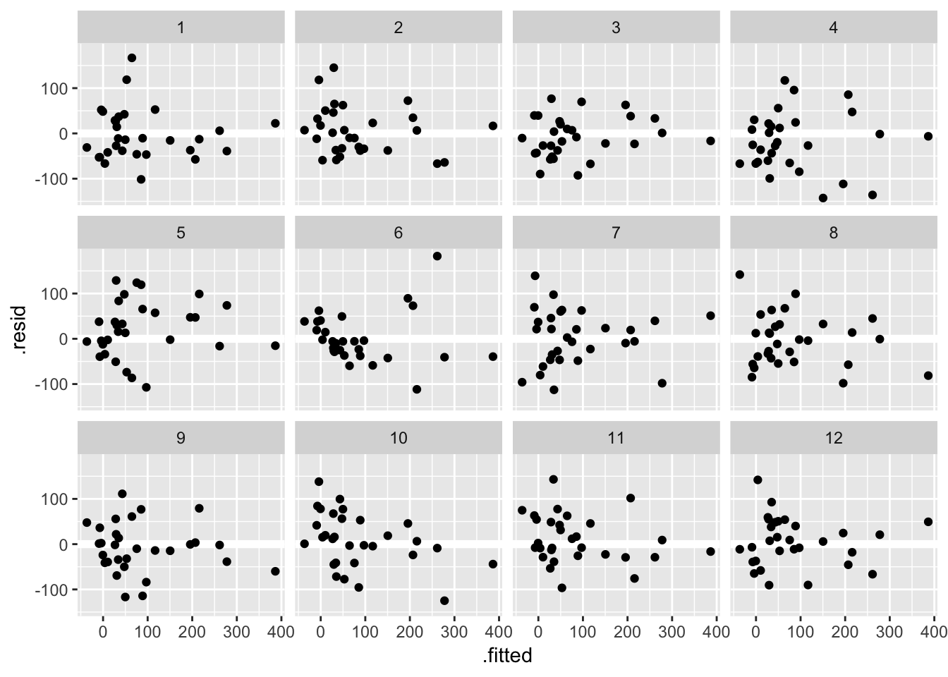
Can you spot the true data? If you want to check your guess copy and paste the decrypt(..) output into R. If the true data stands out, that is evidence the pattern you see in the residuals is beyond that which might be attributable to sampling variation.
Your turn Consider a square root transform for the response Species:
fit_gala_sqrt <- lm(sqrt(Species) ~ Area + Elevation + Nearest + Scruz + Adjacent,
  data = gala)
gala_sqrt_diag <- augment(fit_gala_sqrt, data = gala)
Try conducting a lineup to see if this fixes the undesirable patterns seen in the residual versus fitted value plot.
Does it also fix problems in the Q-Q plot?
Practice
Examine the residual plots for the following 3 model fits. Can you fix any problems you find?
data(cheddar, package = "faraway")
fit_cheddar <- lm(taste ~ Acetic + H2S + Lactic, data = cheddar)
data(teengamb, package = "faraway")
fit_teen <- lm(gamble ~ income + status + income, data = teengamb)
# I purposely left out sex from this model. Can you tell if that is a
# problem from just examing the residual plots?data(cornnit, package = "faraway")
fit_corn <- lm(yield ~ nitrogen, data = cornnit)Case influence statistics
Of the metrics we discussed in class, the leverage and Cook’s Distance are available as part of the output from augment() in the .hat and .cooksd columns respectively. So, it’s relatively easy to examine them, e.g.
gala_sqrt_diag %>%
  arrange(desc(.hat)) %>%
  select(.rownames, .hat)
## # A tibble: 30 x 2
## .rownames .hat
## <chr> <dbl>
## 1 Isabela 0.969
## 2 Fernandina 0.950
## 3 Darwin 0.466
## 4 Genovesa 0.430
## 5 SanCristobal 0.375
## 6 Wolf 0.333
## 7 SanSalvador 0.268
## 8 Pinta 0.247
## 9 SantaCruz 0.178
## 10 Coamano 0.169
## # … with 20 more rowsWhere we see the islands of Isabela and Fernandina have highest leverage.
Faraway suggests a “half-Normal” plot for displaying leverage and Cook’s distance. This is a Q-Q plot of the leverages but our theoretical distribution is now a half-Normal, not a Normal. One way to achieve this in ggplot:
qhnorm <-  function(p) qnorm(0.5 + p/2)
ggplot(gala_sqrt_diag, aes(sample = .hat)) +
  stat_qq(distribution = qhnorm)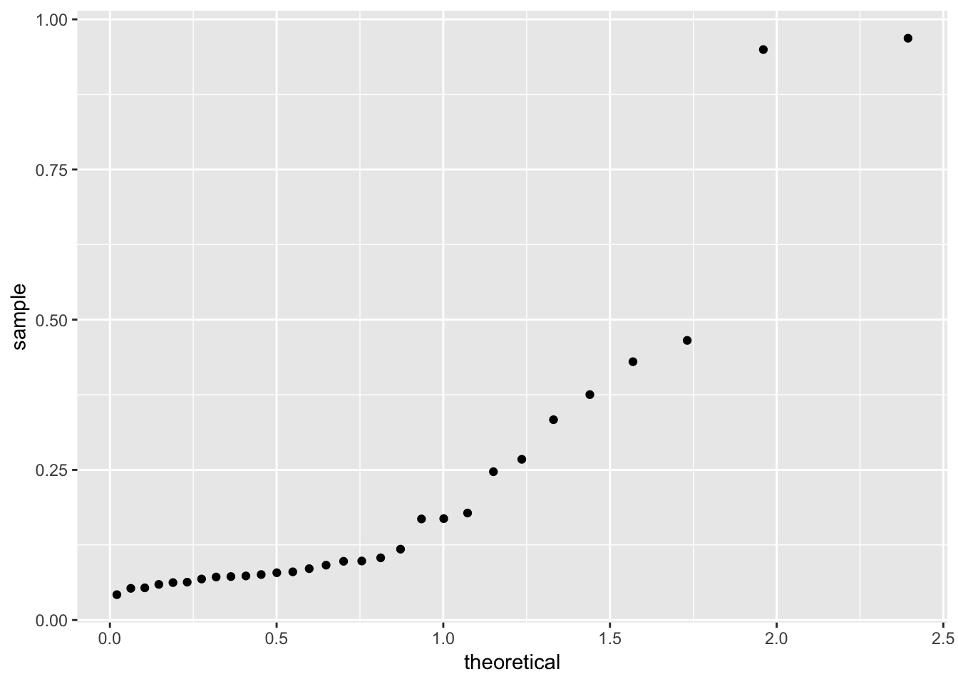
If you want the points labelled, it’s harder, here’s some code I have:
get_theoretical <- function(sample, distribution, dparams = list()){
  n <- length(sample)
  quantiles <- ppoints(n)
  do.call(distribution, c(list(p = quote(quantiles)), dparams))[rank(sample)]
}

library(ggrepel)
ggplot(gala_sqrt_diag, aes(x = get_theoretical(.hat, qhnorm), y = .hat)) +
  geom_point() +
  geom_text_repel(aes(label = ifelse(.hat > 0.2, .rownames, NA))) +
  ylab("Leverages") + xlab("Half-Normal quantiles")
## Warning: Removed 22 rows containing missing values (geom_text_repel).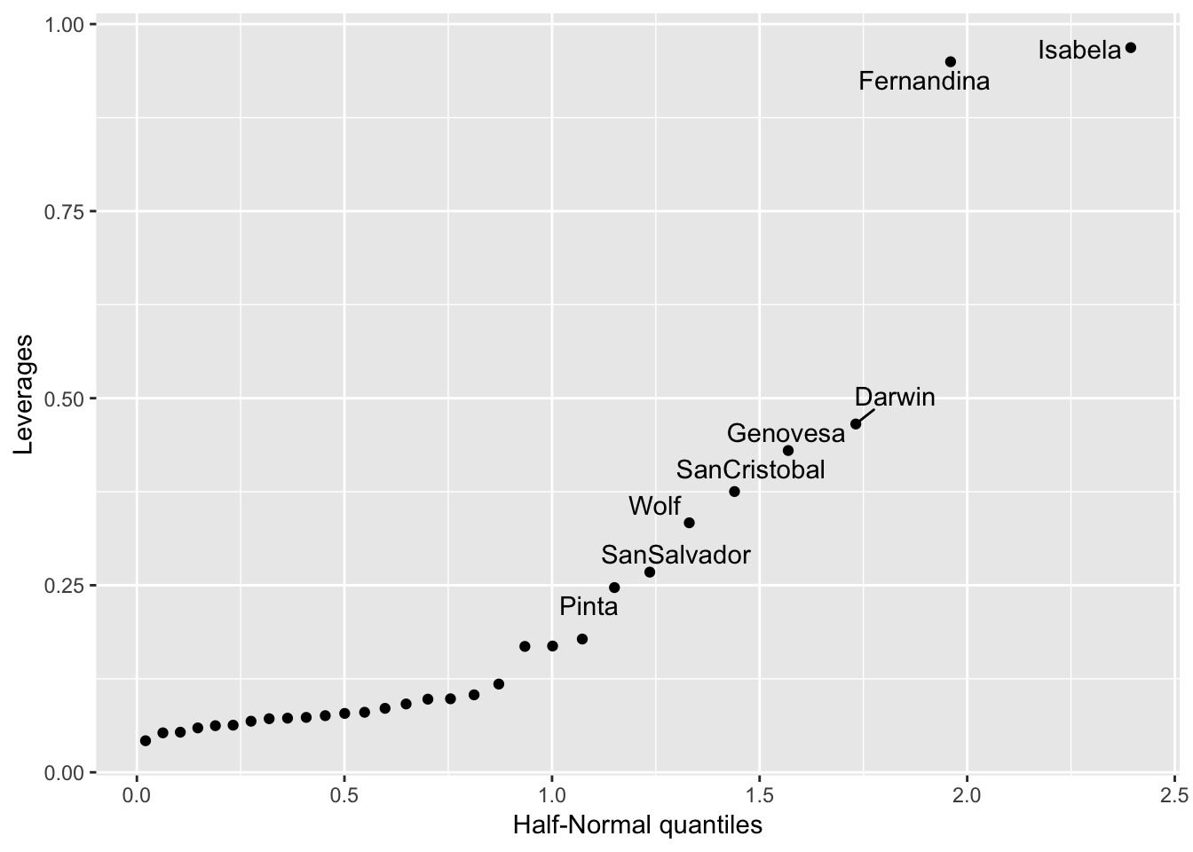
For examining outliers in class we talked about Studentized Residuals. These aren’t part of the output of augment.lm(), but you can add them yourself:
gala_sqrt_diag$.student.resid <- rstudent(fit_gala_sqrt)