Learning Objectives
- Visualize a model by making predictions on a grid of explanatories.
This is one useful strategy for understanding a model. A complementary strategy is to examine the model form mathematically, we’ll see a few examples in class on Friday.
Warmup
library(tidyverse)
library(modelr)
Read more at: https://r4ds.had.co.nz/model-basics.html#visualising-models
For this lab we’ll work with some data from the openintro package. The dataset bdims contains body measurements of 507 physically active individuals. For the purposes of the lab we’ll look at trying to predict a physically active individuals weight.
data(bdims, package = "openintro")
bdims <- bdims %>%
  mutate(sex = as.factor(sex) %>% fct_recode(male = "1", female = "0"))
(bdims <- as_tibble(bdims))
Read more about the data at: ?openintro::bdims
Let’s start with the naive model: \[ \text{weight}_i = \beta_0 + \beta_1 \text{height}_i + \epsilon_i, \quad i = 1, \ldots, 507 \]
Taking a quick look at the data:
ggplot(bdims, aes(hgt, wgt)) +
geom_point() 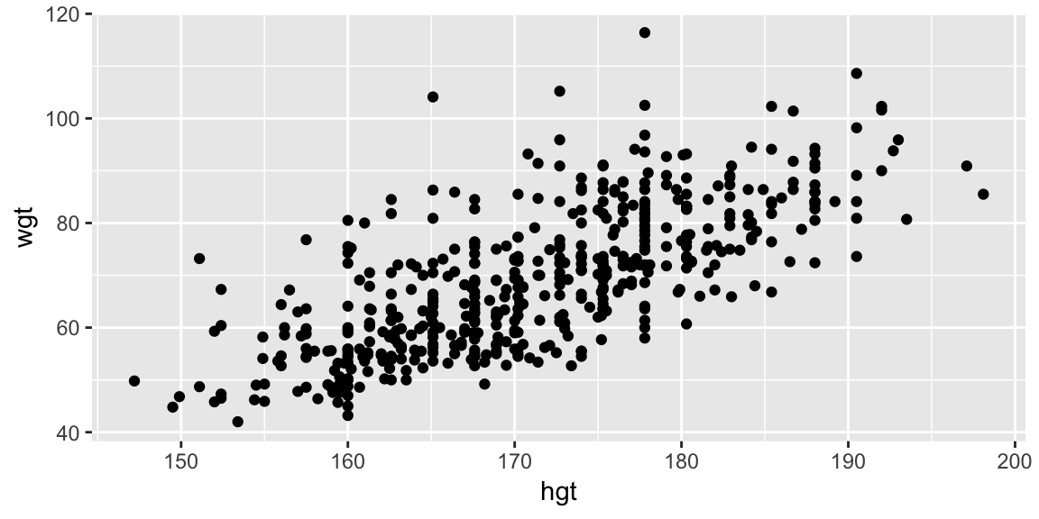
This seems like a reasonable place to start.
We can fit the model to the data with:
fit_hgt <- lm(wgt ~ hgt, data = bdims)
summary(fit_hgt)
##
## Call:
## lm(formula = wgt ~ hgt, data = bdims)
##
## Residuals:
## Min 1Q Median 3Q Max
## -18.743 -6.402 -1.231 5.059 41.103
##
## Coefficients:
## Estimate Std. Error t value Pr(>|t|)
## (Intercept) -105.01125 7.53941 -13.93 <2e-16 ***
## hgt 1.01762 0.04399 23.14 <2e-16 ***
## ---
## Signif. codes: 0 '***' 0.001 '**' 0.01 '*' 0.05 '.' 0.1 ' ' 1
##
## Residual standard error: 9.308 on 505 degrees of freedom
## Multiple R-squared: 0.5145, Adjusted R-squared: 0.5136
## F-statistic: 535.2 on 1 and 505 DF, p-value: < 2.2e-16Now, how do we visualize this fitted model in the context of the data?
There are two common approaches:
Extract the coefficients and add a line with the corresponding slope and intercept:
coefs <- coef(fit_hgt)

ggplot(bdims, aes(hgt, wgt)) +
  geom_point(size = 0.5, alpha = 0.5) +
  geom_abline(intercept = coefs[1], slope = coefs[2], color = "#377EB8")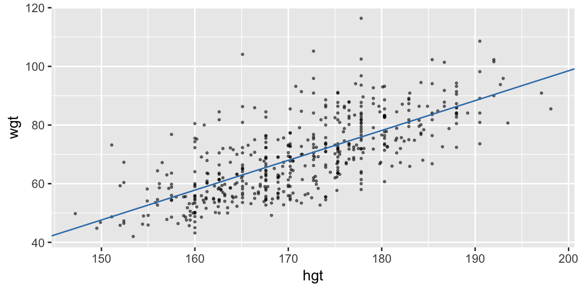
Or, use the model to predict the response on a grid of explanatory values:
(pred_linear <- data_grid(bdims, hgt) %>%
  add_predictions(fit_hgt))
## # A tibble: 147 x 2 ## hgt pred ## <dbl> <dbl> ## 1 147. 44.8 ## 2 150. 47.1 ## 3 150. 47.5 ## 4 151. 48.8 ## 5 152 49.7 ## 6 152. 50.1 ## 7 153. 51.1 ## 8 154. 52.1 ## 9 154. 52.2 ## 10 155. 52.6 ## # ... with 137 more rowsThen join the predictions with a line (Charlotte will build this plot up):
ggplot(bdims, aes(hgt, wgt)) +
  geom_point(size = 0.5, alpha = 0.5) +
  geom_line(aes(y = pred), data = pred_linear, color = "#377EB8")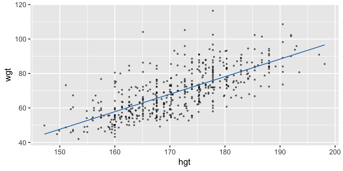
The second approach tends to generalize to more complicated models more easily, and is the approach I’d recommend.
modelr provides functions to help with this approach
Let’s take a closer look at the code used in the second approach:
pred_linear <- data_grid(bdims, hgt) %>%
      add_predictions(fit_hgt)
Two things are happening in this chunk: data_grid() from modelr is being used to create a tibble containing values at which we will make predictions, and add_predictions() also from modelr, is adding a column for the predictions based on our model at these values. The result is just a tibble with we can plot using our usual tools:
pred_linear## # A tibble: 147 x 2
## hgt pred
## <dbl> <dbl>
## 1 147. 44.8
## 2 150. 47.1
## 3 150. 47.5
## 4 151. 48.8
## 5 152 49.7
## 6 152. 50.1
## 7 153. 51.1
## 8 154. 52.1
## 9 154. 52.2
## 10 155. 52.6
## # ... with 137 more rowsLet’s explore data_grid() and add_predictions() in turn. data_grid() takes a data frame and one or more variable names. If you provide a single variable name, it returns the unique values that variable takes in the data:
data_grid(data = bdims, hgt) ## # A tibble: 147 x 1
## hgt
## <dbl>
## 1 147.
## 2 150.
## 3 150.
## 4 151.
## 5 152
## 6 152.
## 7 153.
## 8 154.
## 9 154.
## 10 155.
## # ... with 137 more rowsAlternatively you can use seq_range() to get an evenly spaced grid of values:
data_grid(bdims, hgt = seq_range(hgt, by = 10)) ## # A tibble: 6 x 1
## hgt
## <dbl>
## 1 147.
## 2 157.
## 3 167.
## 4 177.
## 5 187.
## 6 197.If you provide more than one variable, you’ll get all possible combinations of the two:
(grid_hgt_sex <- data_grid(bdims,
  hgt = seq_range(hgt, by = 10), sex))
## # A tibble: 12 x 2
## hgt sex
## <dbl> <fct>
## 1 147. female
## 2 147. male
## 3 157. female
## 4 157. male
## 5 167. female
## 6 167. male
## 7 177. female
## 8 177. male
## 9 187. female
## 10 187. male
## 11 197. female
## 12 197. male(We’ll use this data grid shortly so I’m keeping it in grid_hgt_sex)
This grid specifies the point at which we want to make predictions, add_predictions() also from modelr, will add them if we specify a model:
add_predictions(data = grid_hgt_sex, model = fit_hgt)## # A tibble: 12 x 3
## hgt sex pred
## <dbl> <fct> <dbl>
## 1 147. female 44.8
## 2 147. male 44.8
## 3 157. female 55.0
## 4 157. male 55.0
## 5 167. female 65.1
## 6 167. male 65.1
## 7 177. female 75.3
## 8 177. male 75.3
## 9 187. female 85.5
## 10 187. male 85.5
## 11 197. female 95.7
## 12 197. male 95.7Notice the predictions end up in a columns called pred and our original columns are preserved.
(This is equivalent to predict(fit_height, newdata = data_hgt_sex)) but returns a data frame with the original columns intact).
Plotting this data alone isn’t particularly useful:
pred_hgt_sex <- add_predictions(data = grid_hgt_sex, model = fit_hgt)

ggplot(pred_hgt_sex, aes(hgt, pred)) +
  geom_point()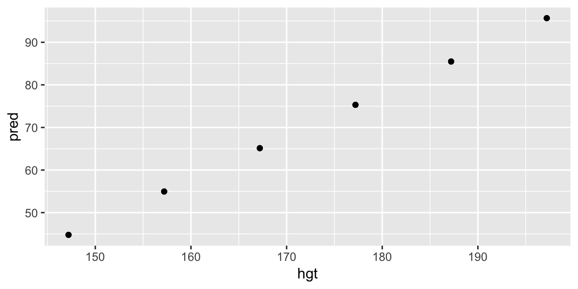
But adding to a layer in our plot of the data helps us understand the model in the context of the data. Putting it all together:
grid_hgt_sex <- data_grid(bdims, hgt = seq_range(hgt, by = 10), sex)
pred_hgt_sex <- add_predictions(grid_hgt_sex, model = fit_hgt)

ggplot(bdims, aes(hgt, wgt)) +
  geom_point(size = 0.5, alpha = 0.5) +
  geom_line(aes(y = pred), data = pred_hgt_sex)
Your turn - a non-linear relationship
A quadratic model in height: \[ \text{weight}_i = \beta_0 + \beta_1 \text{height}_i + \beta_2 \text{height}_i^2 + \epsilon_i, \quad i = 1, \ldots, 507 \]
can be fit with:
fit_height_quad <- lm(wgt ~ hgt + I(hgt^2), data = bdims)Use add_predictions() with grid_hgt_sex to add the fitted model to the plot of the data
grid_hgt_sex <- data_grid(bdims, hgt = seq_range(hgt, n = 1000), sex)
fit_height_poly <- lm(wgt ~ poly(hgt, 10), data = bdims)
pred_poly <- add_predictions(grid_hgt_sex, model = fit_height_poly)

ggplot(bdims, aes(hgt, wgt)) +
  geom_point(size = 0.5, alpha = 0.5) +
  geom_line(aes(y = pred), data = pred_poly)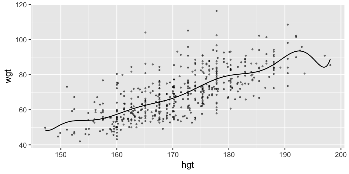
# geom_fun(How did I find a color?)
RColorBrewer::display.brewer.all() # choose a palette
RColorBrewer::brewer.pal(3, "Set1") # extract one of the colors
Visualizing more dimensions
So far we’ve ignored sex but you might imagine it plays a role in the relationship between height and weight. Our current model predicts the same straight line relationship for both male and female:
fit_hgt_sex_1 <- lm(wgt ~ hgt * sex, data = bdims)
fit_hgt_sex_2 <- lm(wgt ~ hgt + sex, data = bdims)

summary(fit_hgt_sex_1)
##
## Call:
## lm(formula = wgt ~ hgt * sex, data = bdims)
##
## Residuals:
## Min 1Q Median 3Q Max
## -20.187 -5.957 -1.439 4.955 43.355
##
## Coefficients:
## Estimate Std. Error t value Pr(>|t|)
## (Intercept) -43.81929 13.77877 -3.180 0.00156 **
## hgt 0.63334 0.08351 7.584 1.63e-13 ***
## sexmale -17.13407 19.56250 -0.876 0.38152
## hgt:sexmale 0.14923 0.11431 1.305 0.19233
## ---
## Signif. codes: 0 '***' 0.001 '**' 0.01 '*' 0.05 '.' 0.1 ' ' 1
##
## Residual standard error: 8.795 on 503 degrees of freedom
## Multiple R-squared: 0.5682, Adjusted R-squared: 0.5657
## F-statistic: 220.7 on 3 and 503 DF, p-value: < 2.2e-16summary(fit_hgt_sex_2)##
## Call:
## lm(formula = wgt ~ hgt + sex, data = bdims)
##
## Residuals:
## Min 1Q Median 3Q Max
## -20.184 -5.978 -1.356 4.709 43.337
##
## Coefficients:
## Estimate Std. Error t value Pr(>|t|)
## (Intercept) -56.94949 9.42444 -6.043 2.95e-09 ***
## hgt 0.71298 0.05707 12.494 < 2e-16 ***
## sexmale 8.36599 1.07296 7.797 3.66e-14 ***
## ---
## Signif. codes: 0 '***' 0.001 '**' 0.01 '*' 0.05 '.' 0.1 ' ' 1
##
## Residual standard error: 8.802 on 504 degrees of freedom
## Multiple R-squared: 0.5668, Adjusted R-squared: 0.5651
## F-statistic: 329.7 on 2 and 504 DF, p-value: < 2.2e-16pred_sex_1 <- add_predictions(grid_hgt_sex, model = fit_hgt_sex_1)
pred_sex_2 <- add_predictions(grid_hgt_sex, model = fit_hgt_sex_2)
ggplot(bdims, aes(hgt, wgt, color = sex)) +
geom_point(size = 0.5, alpha = 0.5) +
geom_line(aes(y = pred), data = pred_sex_1)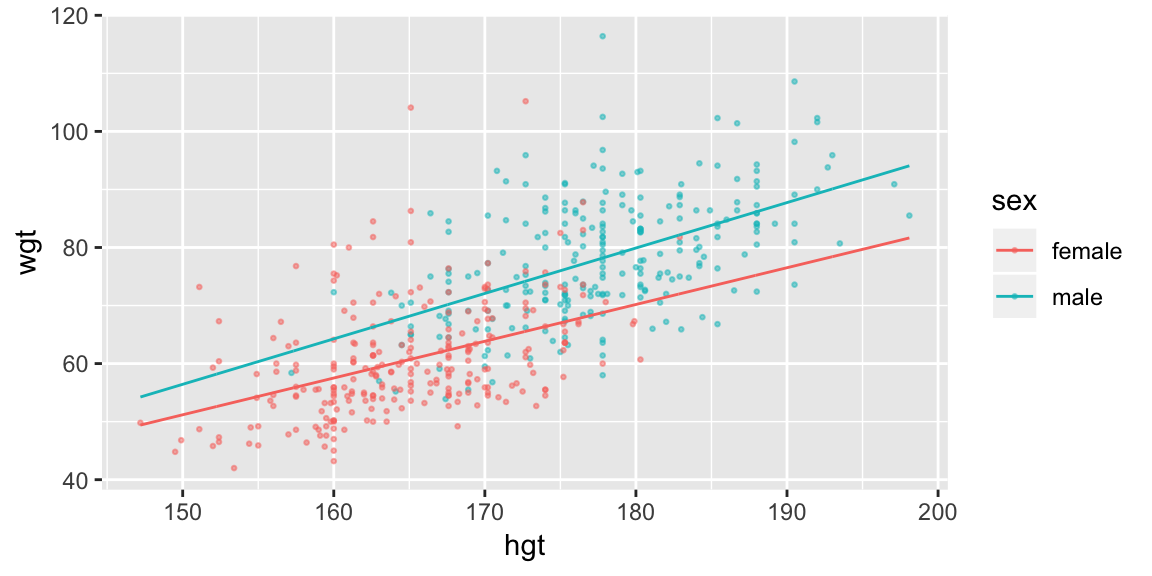
ggplot(bdims, aes(hgt, wgt, color = sex)) +
  geom_point(size = 0.5, alpha = 0.5) +
  geom_line(aes(y = pred), data = pred_sex_2)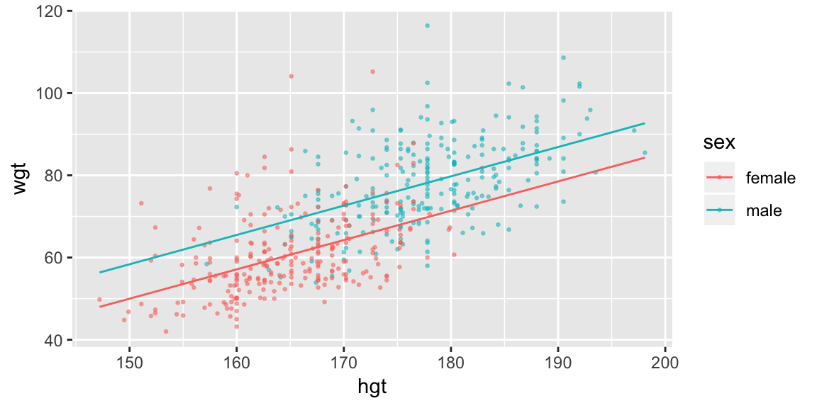
If you want to put both models in one plot:
pred_sex <- add_predictions(grid_hgt_sex, model = fit_hgt_sex_1, "pred_1") %>%
  add_predictions(fit_hgt_sex_2, "pred_2")

ggplot(bdims, aes(hgt, wgt, color = sex)) +
  geom_point(size = 0.5, alpha = 0.5) +
  geom_line(aes(y = pred_1, linetype = "M1"), data = pred_sex) +
  geom_line(aes(y = pred_2, linetype = "M2"), data = pred_sex)

## Or alternatively
pred_sex %>%
  gather("model", "pred", pred_1, pred_2) %>%
  ggplot(aes(hgt, color = sex)) +
    geom_point(aes(y = wgt), size = 0.5, alpha = 0.5, data = bdims) +
    geom_line(aes(y = pred, linetype = model))
Two possible ways of including sex in the regression model are:
fit_hgt_sex_1 <- lm(wgt ~ hgt * sex, data = bdims)
fit_hgt_sex_2 <- lm(wgt ~ hgt + sex, data = bdims)
Your turn: Visualize the two models and describe the difference between them. Try to write down the models that are being fit.
Visualizing residuals
Visualizing predictions only tells us about the patterns the model has captured, but not the ones that it has failed to capture. Residuals are one way to provide this insight.
The modelr function add_residuals() takes two inputs like add_predictions() but now the input data is the observed data:
add_residuals(bdims, fit_hgt_sex_1)## # A tibble: 507 x 26
## bia.di bii.di bit.di che.de che.di elb.di wri.di kne.di ank.di sho.gi
## <dbl> <dbl> <dbl> <dbl> <dbl> <dbl> <dbl> <dbl> <dbl> <dbl>
## 1 42.9 26 31.5 17.7 28 13.1 10.4 18.8 14.1 106.
## 2 43.7 28.5 33.5 16.9 30.8 14 11.8 20.6 15.1 110.
## 3 40.1 28.2 33.3 20.9 31.7 13.9 10.9 19.7 14.1 115.
## 4 44.3 29.9 34 18.4 28.2 13.9 11.2 20.9 15 104.
## 5 42.5 29.9 34 21.5 29.4 15.2 11.6 20.7 14.9 108.
## 6 43.3 27 31.5 19.6 31.3 14 11.5 18.8 13.9 120.
## 7 43.5 30 34 21.9 31.7 16.1 12.5 20.8 15.6 124.
## 8 44.4 29.8 33.2 21.8 28.8 15.1 11.9 21 14.6 120.
## 9 43.5 26.5 32.1 15.5 27.5 14.1 11.2 18.9 13.2 111
## 10 42 28 34 22.5 28 15.6 12 21.1 15 120.
## # ... with 497 more rows, and 16 more variables: che.gi <dbl>,
## # wai.gi <dbl>, nav.gi <dbl>, hip.gi <dbl>, thi.gi <dbl>, bic.gi <dbl>,
## # for.gi <dbl>, kne.gi <dbl>, cal.gi <dbl>, ank.gi <dbl>, wri.gi <dbl>,
## # age <int>, wgt <dbl>, hgt <dbl>, sex <fct>, resid <dbl>Notice there is now an additional column called resid.
Which we can then visualize, for example, here the residuals are plotted against height:
add_residuals(bdims, fit_hgt_sex_1) %>%
  ggplot(aes(hgt, resid, color = sex)) +
    geom_ref_line(h = 0) +
geom_point() 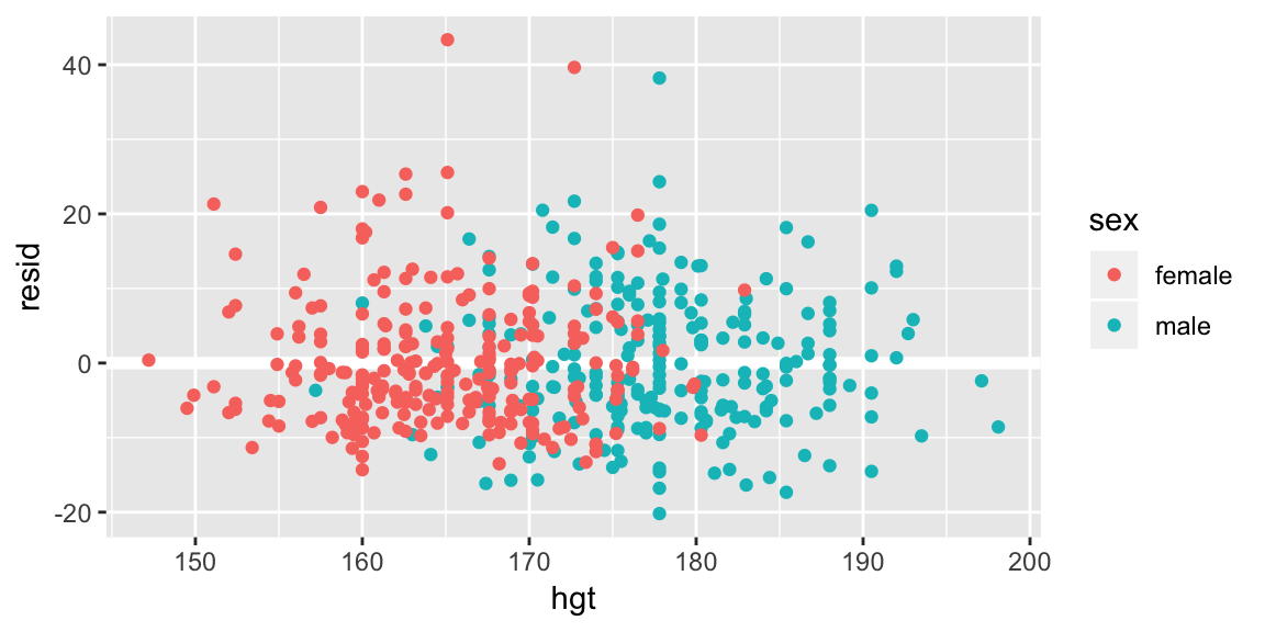
If the model has failed to capture an important relationship between weight and height we’d expect to see a pattern in the average residual as a function of height. A line at zero has been added to help with the comparison. Looks pretty good here.
Your turn Look at the residuals against the variable wai.gi. Does our model fail to capture something?
add_residuals(data = bdims, model = fit_hgt_sex_1) %>%
  ggplot(aes(wai.gi, resid, color = sex)) +
    geom_ref_line(h = 0) +
geom_point() 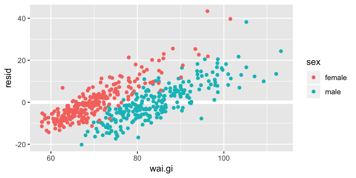
More complicated models
As models get more complicated:
Visualizing more than three variables at a time is hard! A good strategy is to pick a couple of variables to visualize at a time, and make more than one plot. Or fix a variable at a meaningful value.
Use a mathematical examination of the model to influence your choice of interesting views. E.g. A parameter that only shifts the intercept might be omitted from a plot in favor of a parameter that changes the slope.
Make sure your grid has all the variables required for your model. If you pass a model to the
.modelargument indata_grid(), it will pick “typical” values for any needed variables that you don’t specify.
As an example let’s add wai.gi, waist girth, to our model. There are numerous ways we could do this, but let’s look at adding it as a main (linear) effect as well as through an interaction with sex: \[
\begin{aligned}
\text{weight}_i &= \beta_0 + \beta_1 \text{height}_i + \beta_2 \text{male}_i +
\beta_3\text{wai.gi}_i + \\
& \beta_4\left(\text{height}_i \times \text{male}_i\right) + \beta_5\left(\text{wai.gi}_i \times \text{male}_i\right) + \epsilon_i, \quad i = 1, \ldots, 507
\end{aligned}
\]
fit_wai <- lm(wgt ~ hgt*sex + wai.gi*sex, data = bdims)We’ve now got a model with three variables and five parameters. First we need to make sure our data grid contains value for all three variables (notice I’m specifying the sequences a little differently),
(grid_wai <- data_grid(bdims,
  hgt = seq_range(hgt, n = 15, pretty = TRUE),
  wai.gi = seq_range(wai.gi, n = 5, pretty = TRUE),
  sex
))
## # A tibble: 192 x 3
## hgt wai.gi sex
## <int> <int> <fct>
## 1 145 50 female
## 2 145 50 male
## 3 145 60 female
## 4 145 60 male
## 5 145 70 female
## 6 145 70 male
## 7 145 80 female
## 8 145 80 male
## 9 145 90 female
## 10 145 90 male
## # ... with 182 more rowsThen we can add predictions as per usual
pred_wai <- grid_wai %>%
  add_predictions(fit_wai)
A useful way to start, is to fix one of the values, let’s look at holding height constant at 170cm, which we can easily do by filtering the prediction grid, and looking at the predicted weight as a function of waist girth:
pred_wai %>%
  filter(hgt == 170) %>%
  ggplot(aes(wai.gi, pred, color = sex)) +
    geom_line() +
  labs(title = "Height = 170cm")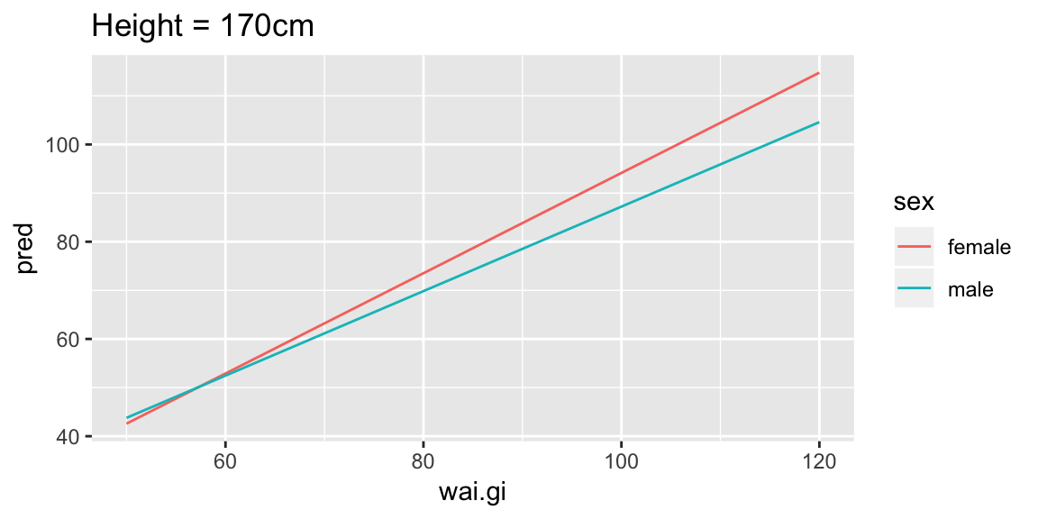
For someone of height 170cm, we can see this model shows increasing waist girth is associated with increasing mean weight (lines have positive slope), and that for females the increase is slightly larger per unit increase in waist girth (female line has steeper slope).
But we only looked at one value of height, we could now repeat this view for our grid of heights:
ggplot(pred_wai, aes(wai.gi, pred, color = sex)) +
  geom_line() +
  facet_wrap(~ hgt, labeller = label_both)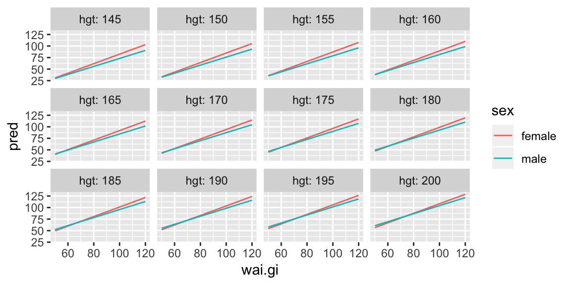
And we see that increasing waist girth is associated with increasing mean weight for all heights, and that for females the increase is slightly larger per unit increase in waist girth for all heights. It’s a little harder to see if the slopes are changing over the different heights. But here’s an alternate view:
ggplot(pred_wai, aes(wai.gi, pred, color = hgt)) +
  geom_line(aes(group = hgt)) +
  facet_wrap(~ sex)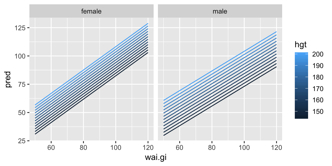
Now it’s easier to see the slope between the predicted weight and waist girth is the same for all heights (the lines are parallel within gender).
Your turn: Fit a model where there is also an interaction between waist girth and height and repeat the above plots.
Wrapping up
Combining the functions
data_grid()andadd_predictions()is a useful way to visualize a model.Residuals are a useful way to look for things our model fails to capture.